
shop update
as promised, i participated in the etsymetal weekly update.
i plan to make this part of my regular routine throughout the first part of the year.
i did add some new designs and still have a couple left that need finishing touches.
i have also decided to redo my pics.
there are too many colored backgrounds and i feel that my shop does not look as cohesive as i would like.
find stormy afternoon here


4 comments:
Here's what I have to say about the different colors.
All your different colors are in the same tones of colors so I don't think it looks bad. Different colors can also showcase different colors of stones. (make them 'pop') So I can see why you chose different backgrounds.
However, I LOVE your gray background. It is my favorite. Some of your darker, pickled pieces won't show up as well, but maybe you could come up with a lighter gray.
Realizing that these two bits are not from someone that has any experience in anything about which she just gave advice. (nice!...sigh) :)
but any advice is important....
i need to know what everyone thinks so i can make the best decision.
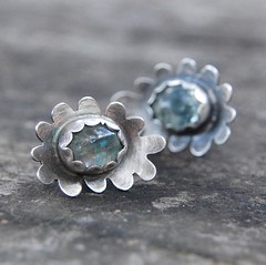
I love these earrings.
and I also like the grey backgrounds a lot. My shop has mostly grey and I find it looks better with the odd (two or three per page) bright photo thrown in. But I'm perennially unhappy with the way my shop looks. I like all the individual things in it but am not at all sure of the whole thing.
But I like this look for your photos a lot.
thanks sophie.
i will be slowly retaking pics of everything that has expired over the next month or two.
i feel like consistent pic backgrounds will help the shop feel more cohesive, regardless of the truth of that.
Post a Comment